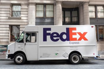
The FedEx logo, with its distinctive purple and orange color scheme and hidden arrow, is one of the most recognizable in the world. But this logo wasn’t always the brand’s symbol. The FedEx logo has undergone significant changes over the years, reflecting the company’s growth and evolution. In this article, we’ll take an in-depth look at when FedEx changed its logo, the reasons behind the change, and the impact this redesign has had on the brand.
FedEx changed its logo as part of a significant rebranding in 1994. The company shortened its name from Federal Express to FedEx and introduced a new logo. The new design retained the purple color from the original logo but replaced red with orange, and it cleverly incorporated a hidden arrow between the “E” and “x” to symbolize speed, accuracy, and forward movement.
The Original FedEx Logo
The original FedEx logo was introduced in 1971. At this time, the company was still known as Federal Express, and the logo reflected this full name. It featured bold purple letters inside a white rectangle, which was divided by a diagonal blue line. The color palette of blue, red, and white was used to symbolize power and professionalism.
The Transition to FedEx
In 1994, FedEx underwent a significant rebranding. The company decided to simplify its brand image and avoid negative associations caused by the word “federal”. To achieve this, they shortened the brand name to FedEx and introduced a new logo, designed by Lindon Leader of Landor Associates.
The new logo retained the purple color from the original logo but replaced red with orange. The white backdrop was maintained to highlight simplicity. The most significant aspect of the new logo, however, was the cleverly placed arrow between the “E” and “x” in FedEx. This hidden arrow symbolizes speed, accuracy, and the company’s ambition for forward movement.
Symbolism and Hidden Meaning
The FedEx logo is renowned for its clever use of negative space and hidden symbolism. The arrow hidden between the “E” and “x” suggests getting from point A to point B reliably, with speed and precision. The logo’s design has been widely praised and has earned over 40 international design awards.
The change from “Federal Express” to “FedEx” aimed to simplify the brand and avoid negative connotations. The current logo was chosen from almost 200 options, with designers aiming to integrate the arrow as naturally as possible.
Public Reaction and Impact on the Brand
The 1994 rebranding, including the logo change, was well-received by customers and the general public. The logo’s design, with its simplicity, effective use of negative space, and impactful color choices, contributed to its instant recognizability. Studies have shown that people can recognize the FedEx logo faster than any other delivery company logo, demonstrating the power of the design in establishing the brand’s identity.
FedEx also used color to differentiate its various business divisions. For example, FedEx Ground’s logo was purple and green, while FedEx Freight was purple and red. In 2016, FedEx decided to retire all of their logo colors except for the standard purple and orange, as most casual observers did not realize the significance of the different color patterns. This change was also positively received, as it simplified the visual identity of the brand and built upon the existing brand equity.
Future Plans for the FedEx Logo
While there are no specific plans mentioned for changes to the FedEx logo in the near future, as technology and design trends continue to evolve, it’s possible that FedEx may choose to refresh their logo in the future.
Conclusion
The evolution of the FedEx logo reflects the company’s growth and expansion into new markets. The current design, with its hidden arrow and effective use of negative space, has contributed to its recognizability and positive associations with the brand. The FedEx logo changes have been successful in creating a strong and consistent brand identity that resonates with customers and the general public.
Frequently Asked Questions
Who designed the current FedEx logo?
The current FedEx logo was designed by Lindon Leader of Landor Associates.
Why did FedEx decide to change its logo in 1994?
FedEx decided to change its logo in 1994 as part of a rebranding process. The company wanted to simplify its brand image and avoid negative associations with the word “federal”.
What does the hidden arrow in the FedEx logo symbolize?
The hidden arrow in the FedEx logo symbolizes speed, accuracy, and the company’s ambition for forward movement.
What was the public reaction to the FedEx logo change?
The logo change was well-received by customers and the general public. The design’s simplicity and effective use of negative space contributed to its instant recognizability.
What colors are used in the current FedEx logo?
The current FedEx logo uses a color scheme of purple and orange.


