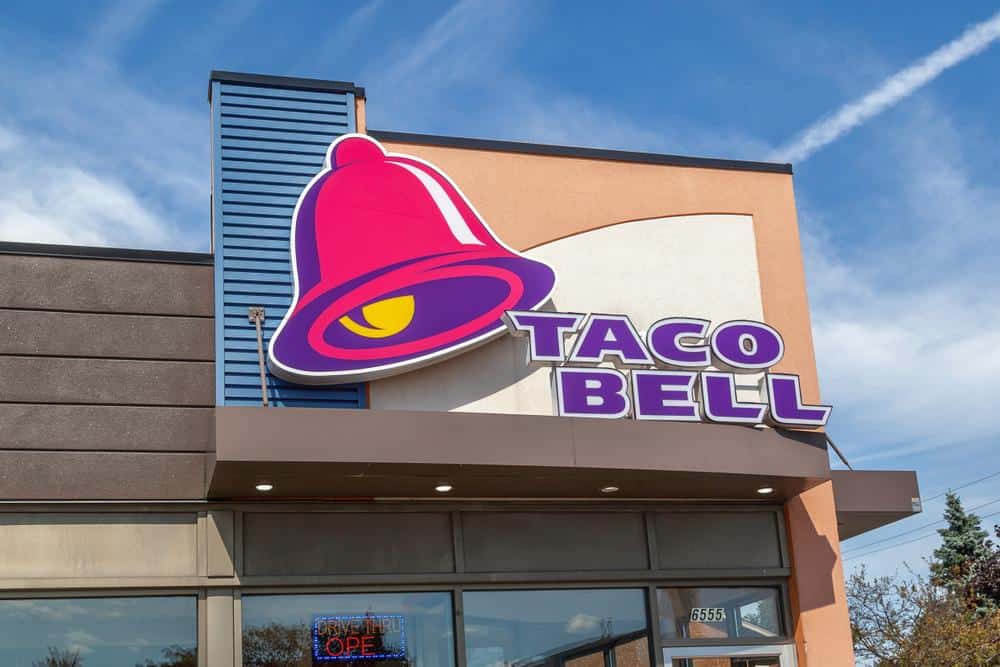
The Taco Bell logo is a familiar sight to many, with its vibrant colors and iconic bell symbol. But have you ever stopped to think about what color the Taco Bell logo actually is? This article dives deep into the color scheme of the Taco Bell logo, its evolution over the years, and how it compares to other fast food logos.
The Taco Bell logo primarily features a combination of dark purple (hex: #702082), light purple (hex: #A77BCA), black (hex: #000000), and white colors. The logo consists of a bell outline in a slanted position, set against an arch-shaped background, with the brand name “Taco Bell” written below in black. The primary color of the logo is dark purple, with the other colors serving as secondary elements.
Current Color Scheme
The current Taco Bell logo features a combination of dark purple, light purple, black, and white colors. The logo consists of an arch-shaped object containing the outline of a bell in a slanted position, with the name “Taco Bell” written in two lines and uppercase letters. The official Taco Bell colors are dark purple (hex: #702082), light purple (hex: #A77BCA), and black (hex: #000000).
The primary color of the Taco Bell logo is dark purple, with light purple, black, and white elements serving as secondary colors. The pink color (hex: #ef1897) and purple color (hex: #36399a) were introduced in the 1992 version of the logo and have been associated with the brand since then.
Evolution of the Taco Bell Logo
The color of the Taco Bell logo has undergone several changes over the years. The original logo, introduced in 1962, featured a colorful wordmark with blue/green, orange, red, and yellow colors. In 1972, the logo shifted to a monochrome design with a dark brown color.
In 1985, the bell icon was introduced, and the logo featured a green, red, and yellow color palette. In 1992, the logo changed to a pink bell on a purple background. The 1994 redesign refined the previous design, making the pink brighter and adding a golden highlight to the bell.
The current Taco Bell logo, introduced in 2016, has a more simplistic design with the bell in white over a two-shade purple arch background, and the wordmark in black.
Logo Color Comparison
The color scheme of Taco Bell’s logo is quite different from other fast food logos. While many fast food restaurants, such as McDonald’s, Burger King, and Wendy’s, use red, yellow, and white in their logos, Taco Bell’s logo uses dark purple, light purple, black, and white. This unique color scheme helps the brand stand out from its competitors.
The Psychology of Color
The color of a logo plays a crucial role in reflecting a brand’s identity and establishing a connection with consumers. Different colors evoke specific emotions and associations, which can influence how people perceive and react to a brand. Taco Bell’s logo uses a combination of blue, pink, and yellow colors, which are intended to appeal to young customers.
Blue represents grace, excellence, and strength, while pink symbolizes youthfulness, and yellow signifies happiness and optimism. The purple color in the logo is associated with luxury and sophistication, helping the brand stand out from its competitors.
Public Reaction
Over the years, the public reaction to the color scheme of the Taco Bell logo has been mixed. The transition to bright pinks and purples in 1992 was initially made to help keep Taco Bell visually distinct from its competitors. However, the introduction of a new logo in 2016, which stripped down the previous logo to the bare essentials, was met with criticism from fans. Despite the mixed reactions, Taco Bell has continued to evolve its logo and color scheme to stay relevant and appealing.
In conclusion, the Taco Bell logo is much more than just a pretty picture. It’s a carefully crafted representation of the brand’s identity, designed to evoke specific emotions and associations in its customers. The next time you see the Taco Bell logo, take a moment to appreciate the thought and effort that went into its design.
Frequently Asked Questions
What was the color scheme of the original Taco Bell logo?
The original Taco Bell logo, introduced in 1962, featured a variety of colors including blue/green, orange, red, and yellow.
When was the bell icon first introduced in the Taco Bell logo?
The bell icon was first introduced in the Taco Bell logo in 1985.
What are the official colors of the current Taco Bell logo?
The official colors of the current Taco Bell logo are dark purple (hex: #702082), light purple (hex: #A77BCA), and black (hex: #000000).
How does the color scheme of the Taco Bell logo compare to other fast food logos?
While many fast food restaurants use red, yellow, and white in their logos, Taco Bell’s logo uses dark purple, light purple, black, and white, making it stand out from its competitors.
Why was the color pink introduced in the Taco Bell logo?
The color pink was introduced in the 1992 version of the logo to help make Taco Bell visually distinct from its competitors and to symbolize youthfulness.
What was the public reaction to the changes in the Taco Bell logo over the years?
The public reaction to the changes in the Taco Bell logo has been mixed. The transition to bright pinks and purples in 1992 was generally well-received, but the introduction of a new logo in 2016, which simplified the previous design, was met with criticism from some fans.

