The iconic fast-food chain, Taco Bell, is not only known for its delicious tacos and burritos, but also for its recognizable logo. But did you know that the Taco Bell logo has undergone several transformations since its inception? Let’s take a deep dive into the history of Taco Bell’s logo changes and explore the reasons behind each redesign.
The most recent change to the Taco Bell logo occurred on November 14, 2016. The company introduced a new, minimalistic logo designed by Lippincott Studios in collaboration with Taco Bell’s in-house design team. This marked the first update to the Taco Bell logo in over 20 years.
The Birth of the Taco Bell Logo
Taco Bell was founded in 1962 by Glen Bell, and its first logo was launched around the same time. The original logo was a colorful, festive design that featured a sombrero and a bell, symbolizing the brand’s Mexican-inspired fast food offerings. This logo was in use for approximately a decade.
The Evolution of the Logo
The first logo change for Taco Bell occurred in 1972. The company shifted from its original logo to a simpler, monochrome wordmark in dark brown. This change marked a shift in the brand’s identity, moving away from its colorful and festive origins to a more simplified design.
In 1985, Taco Bell introduced the third version of its logo, which featured the iconic bell design for the first time. This change was significant as it introduced a symbol that would become synonymous with the brand.
The logo was redesigned again in 1992, with the bell becoming oblique and a blue-violet hue prevailing in the color scheme. It was a bold move that distinguished the brand from its competitors.
The Most Recent Logo Change
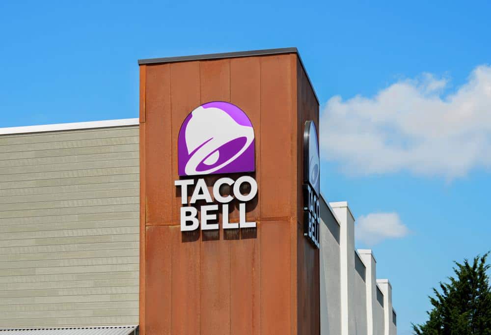
The most recent logo change occurred on November 14, 2016, when Taco Bell introduced a new minimalistic logo. This logo is a more simplified version of the 1995 logo and was designed by Lippincott Studios in collaboration with Taco Bell’s in-house design team. The updated design features a sans-serif typeface, black title, and a bell formed from negative space with several shades of purple. This change marked the first update to the Taco Bell logo in over 20 years.
This logo change was met with mixed reactions from customers. Some loved the modern and sleek design, while others felt that the logo lost some of its personality. Regardless of the reactions, the logo change was a strategic move by Taco Bell to reflect its brand evolution and new strategy.
The Impact of the Logo Changes
Each logo change has had a significant impact on Taco Bell’s brand identity and recognition. The changes have helped the brand adapt to changing times and maintain its relevance in the competitive fast-food industry.
The current logo, with its modern and vibrant color palette, clean sans-serif typeface, and iconic bell symbol, represents Taco Bell’s commitment to innovation and its modern approach to fast food. While it may have received mixed reactions at first, it has become an iconic symbol of the brand.
The Future of the Taco Bell Logo
As of now, there are no known plans for future logo changes for Taco Bell. The company has not made any announcements or indications of another logo change in the near future. However, as with any successful brand, Taco Bell will continue to evolve and adapt to stay relevant in the fast-paced fast-food industry.
In conclusion, Taco Bell’s logo has undergone several transformations since its inception, each reflecting the brand’s evolution and its adaptability to changing times. The current logo, introduced in 2016, stands as a testament to Taco Bell’s modern approach to fast food and its commitment to innovation.
Frequently Asked Questions
Who was the designer of the original Taco Bell logo?
The original Taco Bell logo was designed by the company’s founder, Glen Bell, and his team.
Why did Taco Bell decide to change its logo in 2016?
The 2016 logo redesign was a strategic move by Taco Bell to reflect its brand evolution and new strategy. The company wanted a logo that represented its modern approach to fast food and its commitment to innovation.
Has the logo change affected Taco Bell’s business?
While there’s no direct evidence that the logo change has significantly affected Taco Bell’s business, it’s clear that each logo update has helped the brand maintain its relevance in the competitive fast-food industry.
What was the public reaction to the 2016 logo change?
The 2016 logo change was met with mixed reactions from customers. Some appreciated the modern and sleek design, while others felt that the logo lost some of its personality.
How many times has the Taco Bell logo changed since the company was founded?
The Taco Bell logo has undergone four major changes since the company was founded in 1962. The changes occurred in 1972, 1985, 1992, and most recently in 2016.

